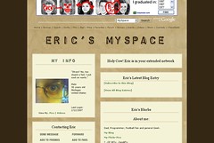
I confess, I confess. It’s true. I have sunk into the depths of all that is ugly, cheap, and downright evil. That [http://www.starwars.com/databank/updates/news20011205.html|wretched hive of scum and villainy]; I have created a MySpace page. But fear not, I am not about to sink into the depths of black backgrounds, glittery animated gifs, and autoloading emo music. (I’d link to some examples, but considering 99.99% of MySpace pages are perfect examples of this, I’ll let the reader explore for themselves.)
 {width=”240” height=”162”}I have always been a little weary of MySpace– every time I had stumbled into it I was immediately put off by the sheer ugliness of it. It was like I had stepped into a time warp back to 1996. Blinking text, animated images, black backgrounds, COMIC SANS MS… But you have to admit they must be doing something right to have millions of members. The pure volume of people in a social network like that is worth tapping into. My employer agrees, and as an outreach project, the [http://www.aadl.org|AADL] is in the process of creating a MySpace page. When asked, I happily joined up to help with some of the technical details.
The first order of business was to find a decent layout. There are tons of third-party sites devoted to crappy cut and paste layouts for your MySpace, with some diamonds in the rough. But still they didn’t look very clean or professional. Then, by luck or fate, I found [http://www.mikeindustries.com/|Mike Davidson’s] blog post, [http://www.mikeindustries.com/blog/archive/2006/04/hacking-myspace-layouts|Hacking A More Tasteful MySpace]. This is what I was looking for! Mike had carefully and painstakingly dissected the mishmash of HTML elements on a MySpace profile page and was able to constuct CSS rules to tame them. Thank goodness. In order to try them out, and because of the social networking aspect of it, I created [http://www.myspace.com/ejkook|my own MySpace page] and tested out Mike’s brilliant work. It still needs a little tweaking, but I think it’s safe to say it’s already looking better than most.
I filled out some info and did a quick search and found a good friend of mine who used to live next door to me. We lost touch after high school and it’s great to touch base with him. I’ve already found some other folks from my past that I need to contact. Plus, it’s another place to let people find my flickr stream and this blog. MySpace is not all bad so far.
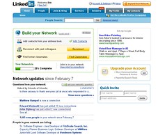
 {width=”240” height=”194”}In contrast, on the same day that I created my MySpace account, I was serendipitously invited by [http://www.blyberg.net|John] to join [http://www.linkedin.com|LinkedIn] a social networking site for professionals. I had read about it a little from [http://vielmetti.typepad.com/vacuum/|Ed Vielmetti]. You create a profile with your professional experience, and you can make connections to the profiles of former and existing coworkers, friends, and family. They have millions of users at this point (though not quite the numbers that MySpace has). The key is the chaining of connections from 2 and 3 degrees away from your own. They make it easy to get your connections to introduce you to their connections, who then you can add to your connections, building your professional network online. Oh, and the site is has a clean, useful design, and everybody’s profile looks exactly as good as everyone else’s. It’s a cool idea, and I think it’ll be tons more beneficial than MySpace in the long run.
[http://www.myspace.com/ejkook|View My MySpace]
[http://www.linkedin.com/in/ericklooster|View My LinkedIn Profile]